Wedding invitations are always a great way to tell a couple’s story. Karen from It’s Amore Design + Letterpress sent over her own wedding invitation suite last week and I’m so excited to share her story and invites. As a wedding stationery designer she found that designing her own wedding invitations was one of the most challenging things to do! She ended up collaborating with one of her friends, Keika Yamaguchi, who happens to be a talented children’s book illustrator.
Together they created not one, but TWO invitations, because there were two very different wedding venues with different guest lists. One venue was an outdoor rustic wedding in the mountains and the other took place in a traditional Chinese banquet hall! So here it goes… a tale of two invitations:

From Karen: We knew our stationery for the wedding would be a key storytelling element. The wedding site of our first venue, the Trinity Alps Wilderness, is a very special place for Brendan and me. Not only was it the place we got engaged, but it's a place we go back to often to be out in nature, kind of like our sanctuary. We wanted our guests to know how special it is so we incorporated a lot of details in the design like the flowers and butterflies.


We had planned a wedding weekend and included an illustrated map for all the activity locations. All the invitation pieces were wrapped up as a package with a brass butterfly and gold glitter twine and then carefully tucked into an envelope with the guests’ address in calligraphy.

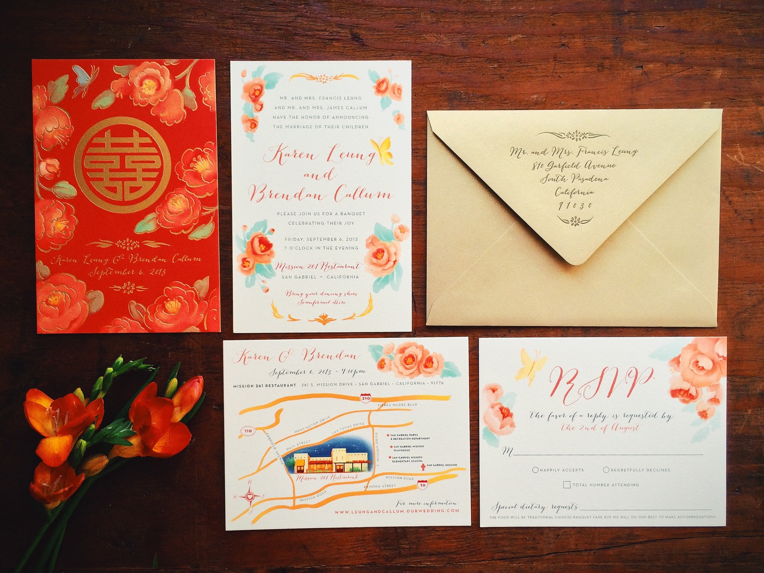
Our second venue was a traditional Chinese banquet hall, where we would celebrate my family's Chinese heritage. For this part of the invitation we wanted to make sure we had good feng shui so we included the Chinese character for “double happiness” while continuing the watercolor floral motifs.


I frequently do custom wedding invites, but I found that designing for yourself is quite hard. Keika did the beautiful watercolor illustrations while I focused on the overall design and typography. There are touches of gold foil throughout the design to give highlights to the florals and type. They are printed digitally on 100% cotton cardstock with gold foiled details. Our collaboration together created something more beautiful than I could have ever imagined!

Photo credit: Kris Holland